Since its establishment in 1994, Luye Life Sciences has expanded from the shore of the Yellow Sea in Yantai to Singapore, the United States, Germany, Japan, and Australia...and its staff has grown from several hundred to more than fifteen thousand worldwide. From the pharmaceutical industry to the fields of specialized medical services, molecular diagnosis and life science technology development, Luye Life Sciences has become an international pharmaceutical and healthcare enterprise.
Luye is growing and changing and has never stopped striving toward the lofty mission and great ambition of "serving human health with professional technological services". To adapt to the Group's global strategic goal and the needs of global business expansion, in 2019 we have launched a wholly new brand image that highlights our global and future-oriented development strategy.
A wholly new Luye Life Sciences has stricken a pose on the stage.
Looking back, Luye Life Sciences has been constantly exploring and practicing reform trends in the life science field, and with reverence for life, we have offered world-class pharmaceutical products and services to patients in China and around the world and brought China's innovation models and practical experience to the world.
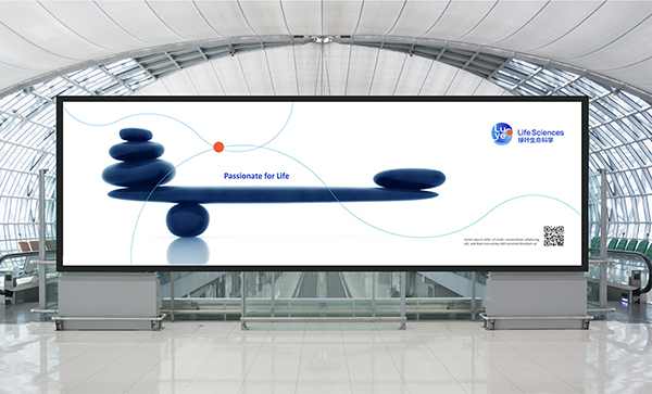
During our exploration, we have been asking ourselves what the origin is. Like everyone else, we are searching our true thought deep in our hearts through self-examination and exploration, Passionate for life, that's the source power driving us forward.
Spirit
The fresh spirit that our brand conveys and combines the delicate attention and support of the 'caregiver' with the ingenuity and bravery of the 'explorer'. The resulting brand visual style has greater depth and positions us as forward looking, people-oriented life scientists.
Figure
Life begins with cells, and so does our design inspiration.
The logo adopts a flexible and rounded shape that is always full of vitality. It hides a Taiji symbol full of Oriental wisdom, implying a smart balance and the infinite energy to change and grow.
The dots in the logo are like the nucleus of a cell, symbolizing source of our cherished life. They are showcasing the brand idea ‘Living Technology for Life’. The closely flowing around the surrounding area resembling the cytoplasm that surrounds the nucleus, symbolizes our innovation and adaptiveness as we push life sciences forward to protect lives.
It is a unique badge worn on the chest of every Luye person, reminding us of courage to explore, join hands with the passion of innovation, and make every effort to achieve our promise: to create vitality and technology to wholeheartedly care for the promise of life, and to honor this lofty cause.
Naming
The four letters of LUYE are divided into their syllables and split across two lines. Four simple and easy-to-read letters are arranged as a square format with the 'L' and 'Y' breaking the pattern so slightly – providing enough space to extend for explorer. This is also a nod to the heritage of the brand as the logo resembles a carved Chinese jade seal. Wherever the Luye Life Sciences Brand goes, it will leave a deep impression of "from China, for the world". The perfect combination of Chinese and Western elements has greatly improved brand recognition and memory, and laid a solid foundation for the globalization of Luye Life Sciences.
Color
In terms of color, Luye Life Sciences is no longer simply green. As a global brand the colors of Luye are inspired by the diversity and beauty of landscapes all over the world - from the purest Nordic ice sea blue to the most energetic South Asian volcanic red and from the strongest South Australian rock orange to the longest-lived North American oak green. Blues and greens evoke the notion of a challenging 'explorer' while reds and oranges convey the warmth of the 'caregiver'. Together they express a unique spectrum of Luye Life Sciences, creating a unique and vibrant brand experience that channels the vitality of the Luye Life Sciences brand.
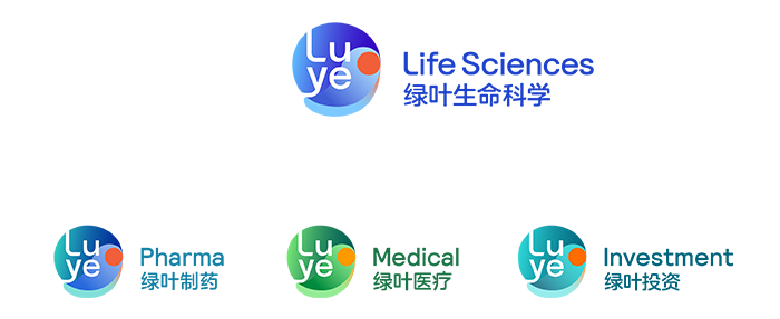
The Luye Family
The three business sector brands and Group brands are like brothers and sisters from the same family. Although different in appearance, they share the same blood. Shane Greeves, the chief global brand creative officer from FutureBrand, said: "This design strategy of 'one family, many faces' not only meets the different needs of sub-brands within the group, but also realizes the harmony and difference of all brands as a family, and shapes the image of the Luye Life Sciences brand with both vitality and strength."
FB designers have designed a set of ideas for the implementation and application of Luye Life Sciences' logo. After you read the following, we believe you will be overwhelmed by the charm of the new image, and feel Luye Life Sciences' spiritual strength of self-breakthrough and bold innovation. The comprehensive implementation of the new logo will be gradually completed in the coming days.
Behind the change of the new brand look are Luye staff's and friends' high expectations. We hope you will join us to welcome a brand new Luye Life Sciences!